
Sometimes the best quilting inspiration has nothing to do with quilting.
A few weeks ago I attended a flower arranging workshop where we created loose, hand-held arrangements inspired by the natural movement of wildflowers. I arrived expecting to play with flowers and leave with a beautiful bouquet.
Instead, I left with several quilt colour palettes.
One of my favourite creative exercises is looking for colour inspiration outside of the quilting world. Whether it’s a morning walk, a painted door, a sunset, or a bucket of flowers, I love training myself to notice colour combinations that I might otherwise overlook.
This wasn’t about planning my next quilt.
It was about practicing the skill of seeing.

Some of the links below are affiliate links, which means I may earn a small commission if you choose to shop through them, at no extra cost to you. I only share fabrics and tools I genuinely love and would happily use myself.
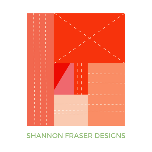
Looking Beyond Fabric for Inspiration
When we’re choosing fabrics, it’s easy to stay inside the quilting world.
- We browse fabric collections.
- We scroll through finished quilts.
- We pull inspiration from Pinterest.
There’s nothing wrong with that, but sometimes the most interesting colour combinations come from places where colour wasn’t intentionally curated for quilting.
Flowers are a perfect example.
Nature doesn’t follow quilting colour rules.
It simply works.
And that’s what makes it such a rich source of inspiration.

The Flowers That Caught My Eye
During the workshop, I found myself repeatedly drawn toward three groups of flowers:
- Soft pink and white ranunculus
- Bright spring tulips
- Dusty purple blooms with deeper centres
Each arrangement contained a completely different mood and energy.
What fascinated me most was how many colour stories were hiding within the same collection of flowers.

Exercise One: Light Ranunculus
The first palette came from the soft blush ranunculus.
At first glance, they seem simple:
- pale pink
- creamy white
- dusty rose
But when I looked more closely, I started noticing deeper burgundy shadows, muted olive greens in the stems, and warm brown undertones throughout the arrangement.

When translated into a Flight Plan mock-up, the result felt:
- elegant
- romantic
- slightly vintage
- calm and sophisticated

Some of these pinks and richer burgundy tones are right up my alley, but the taupes and muted greens aren’t colours I typically reach for. Yet seeing them together in the flowers reminded me that inspiration often comes from combinations we’d never choose on our own.
Exercise Two: The Same Ranunculus, Different Interpretation
One thing I quickly realized is that inspiration isn’t a formula.
It’s interpretation.
Looking at the exact same flowers, I pulled a second palette.
This time I focused more heavily on the deeper pinks, richer burgundies, and stronger greens.

The resulting quilt feels much bolder and more dramatic.
The flowers didn’t change.
Only my interpretation changed.
And suddenly the same source material produced an entirely different quilt.

That realization alone made the exercise worthwhile.
Exercise Three: Tulip Energy
The tulips brought a completely different personality.
Unlike the softer ranunculus, these flowers felt vibrant, energetic, and playful.
I noticed:
- creamy neutrals
- bright coral
- orange
- hot pink
- fresh greens
- soft lavender

These colours immediately pushed me toward a more modern, energetic palette.
When applied to Flight Plan, the quilt became bright, cheerful, and full of movement.

It’s the sort of palette that feels impossible to ignore.
Exercise Four: The Purple Flowers
The final palette came from a bucket of dusty pink and purple blooms that initially didn’t catch my attention as strongly as the ranunculus or tulips.
But the longer I looked, the more colour possibilities I discovered.
What first appeared to be “just pink flowers” revealed an incredible range of tones:
- warm neutral browns
- dusty mauve
- soft lavender
- muted rose
- deep berry purple
- sage and olive greens

What fascinated me most was how different this palette felt from the others.
The ranunculus inspired soft elegance.
The tulips felt bright and energetic.
These flowers felt quieter and more sophisticated.

When translated into a Flight Plan mock-up, the result was a palette with depth and subtle contrast. The mauves and purples create movement throughout the quilt, while the greens add balance and the neutrals provide space for the richer colours to shine.

It’s a good reminder that inspiration doesn’t always come from the flowers demanding attention. Sometimes it’s the quieter combinations that reveal the most interesting colour stories.
What This Exercise Taught Me
The biggest takeaway wasn’t a colour palette.
It was a reminder that inspiration doesn’t produce a single answer.
A single flower arranging class inspired multiple quilt colour stories.
None of them are right.
None of them are wrong.
They’re simply different interpretations of the same source.
As quilters, we sometimes put a lot of pressure on ourselves to choose the “correct” fabrics.
But creativity doesn’t work that way.
Two people can stand in front of the same bouquet and see completely different quilts.
That’s part of the magic.

A Note About Translating Colour into Fabric
One thing this exercise reminded me of is that colour inspiration and fabric selection aren’t exactly the same thing.
While I could identify the colours I saw in the flowers, finding perfect matches in fabric wasn’t always possible. Some shades simply don’t exist in a particular fabric line, while others may lean warmer, cooler, brighter, or more muted than the original source.
That’s why I rarely aim for an exact match.
Instead, I focus on capturing the feeling of the colours that inspired me.
This is also one of the reasons I enjoy keeping colour cards from different fabric manufacturers on hand. Each company has its own strengths. Some offer a wider range of saturated colours, while others excel at subtle neutrals, soft pastels, or complex in-between shades.
The more options you have available, the easier it becomes to translate inspiration from the world around you into fabric.
And sometimes those limitations lead to unexpected discoveries. A colour that wasn’t available in fabric may push you toward a slightly different choice—and occasionally that new direction becomes even more interesting than the original inspiration.

A Challenge for You
The next time you’re out for a walk, visiting a garden centre, arranging flowers, or even grocery shopping, try this exercise.
Take a photo.
Look closely.
Then ask yourself:
- What colours do I actually see?
- Which colours stand out most?
- What happens if I emphasize different colours?
- How would those colours translate into fabric?
You may be surprised by how many quilt colour palettes are hiding in everyday life.
For more quilty inspiration, check out:

Inspiration Is Everywhere
This flower arranging workshop reminded me that creativity often happens when we stop looking so hard for it.
The goal wasn’t to design a quilt.
The goal was simply to pay attention.
And somewhere between the ranunculus, tulips, and dusty pink flowers, I found four completely different colour stories waiting to be explored.
Not because I needed another quilt.
But because learning to see colour is a skill worth practicing.
xo,
Shannon
Want me to create more nature-inspired quilt colour palettes like this one? Join my weekly newsletter so you don’t miss the next one.
This post uses affiliate links. For more info, visit the FAQ page.
Yes…I’m melting in Ottawa as well! I love this inspiration idea for palettes! I have a question as to what tool you used to create the coloured squares for the palettes.
Thrilled to hear you enjoyed the colour inspiration, Jane! I use Adobe Illustrator to create my colour palettes, but you could probably do something similar using Canva 🙂
Excellent! Thank you 🙂
Shannon ~
While I find all of your posts interesting, this one stood out as exceptional! Nature in general and flowers in particular are central pieces of my life (of course, sewing & quilting rock my world too!). Truly loved your flower-inspired palettes. I’ll have to give this a go. Great way to use my Palette Scout color cards by Zollie.
We’re two peas in a pod, Iris! I absolutely love nature and find it to be a never-ending source of inspiration. I haven’t heard of the Palette Scout color cards – thank you for sharing!
Over the years I’ve subscribed to lot of quilt content yet I find myself coming back to a handful of designers that inspire. You are one of those! Loved this post about color inspiration from nature. Thank you for feeding my creativity!
Oh, that’s music to my ears, Liz! Thank you so much for your kind words. It means a lot to know that my work continues to inspire you after all these years. My hope is always to encourage curiosity, creativity, and a willingness to explore, so hearing that this post helped spark some inspiration absolutely makes my day. ❤️
What a great post…you’re a fantastic ‘tour guide’!
Thrilled to hear you enjoyed this one, Jamie!
Great inspo Shannon, it amazes me how differently a quilt pattern presents with different colour combinations. I’ve come realize that the look and feel of a finished quilt is as much (sometimes more) about the fabric colour choices as the pattern itself.
I do enjoy how you use and combine colour.
Thanks for this.
Lynn
So true, Lynn! I love that about quilting – the fabrics and colours we feature really have an impact on the final look and feel of our quilts 🙂