
Did you catch the announcement?
There’s a new colour of the year that will be the focus of home décor, artwork, party planning, right down to, you guessed it, quilts!
If you’re looking to stitch with a new colour and want to be inspired by the ‘it’ colour of the year then you’ll be happy to see Pantone revealed their Pantone Colour of the year 2022 as Very Peri (which totally reminds me of Periwinkle!).
This gorgeous cool-toned purply blue hue has firey undertones from the infusion of red-violet.
The Pantone academy describes the colour as
“Encompassing the qualities of the blues, yet at the same time possessing a violet-red undertone, PANTONE 17-3938 Very Peri displays a spritely, joyous attitude and dynamic presence that encourages courageous creativity and imaginative expression.”
I sum it up as scrummy – ha!
Really, it reminds me of Provence with some sass. That’s what comes to mind when I see this shade.
And it got me curious to see what this new hue could mean for a quilty practice.
The first thing I did?

*This post contains affiliate links, meaning, at no additional cost to you, if you click through and make a purchase, I may receive a commission.
COLOUR CARDS
Grab my colour cards, of course 😉
You know my love for stocking these colouriffic chips. They make designing and planning new quilts easy peasy. You can read more about my love for them here but suffice to say I always encourage you to pick up a set of your own:
Here’s where things can get fun.
When planning a new colourway for your quilts, it’s fun to have a starting point in mind. Here you’re starting with Very Peri, but that’s just the starting point. From there, you have a few choices. You can keep it literal and match the exact same hue, tone and value as Pantone has shown or you can be inspired by the colour and find a similar colour that gives you the same vibes.
MATCHY-MATCHY
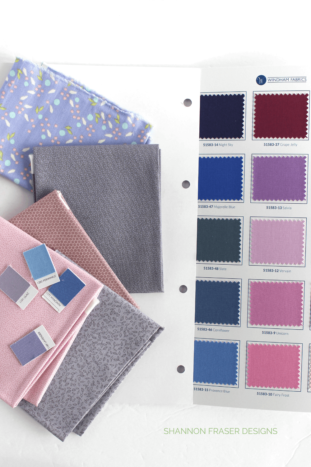
I went through all my colour cards and tried matching the Very Peri as perfectly as possible. As much as there’s a plethora of fabrics out there, you can’t always source an exact match, but you can get close!
Here I’ve tried matching it to some of the fabric colour cards I had on hand:

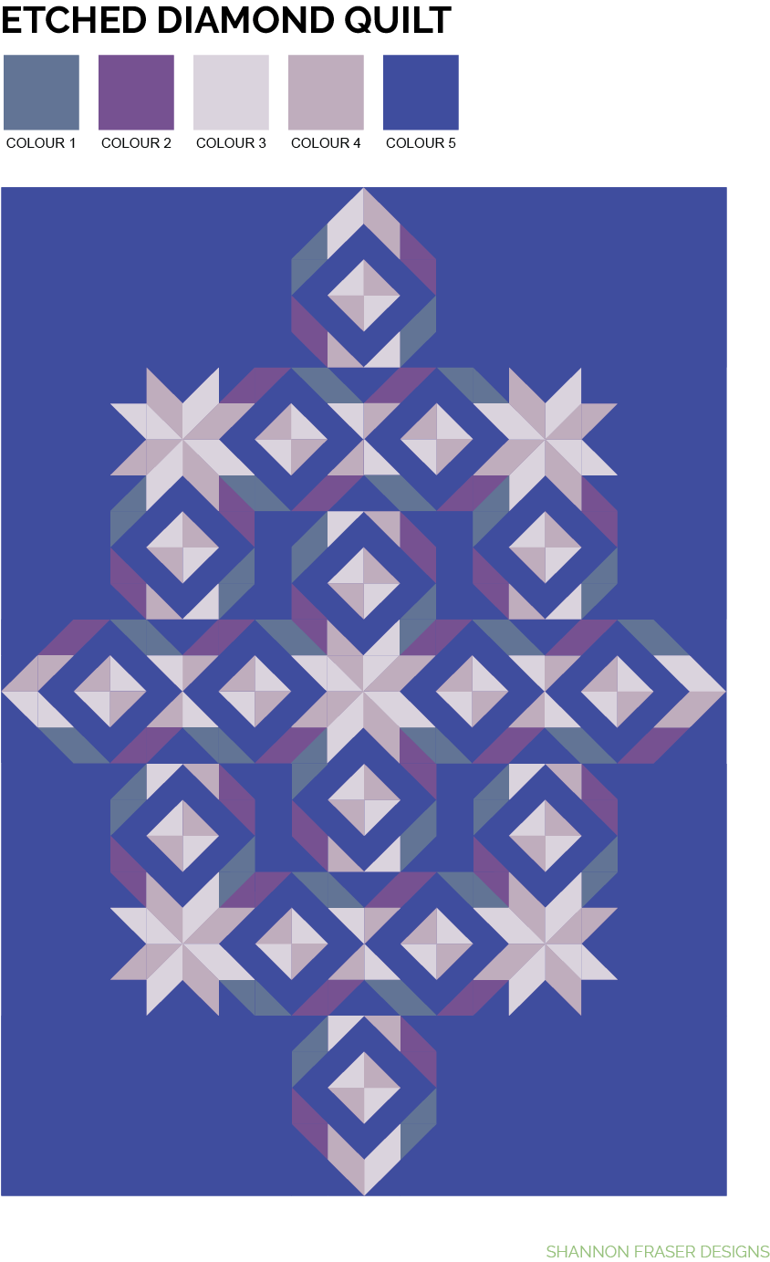
ETCHED DIAMOND QUILT x PANTONE COLOR OF THE YEAR 2022 – VERY PERI INSPIRED
What’s fun is there’s no hard and fastened rules here, you get to decide what you want the focus to be on. Fun, right?!
Ok, here’s where things can be even more fun, let’s see how those different colours would look mocked up as a quilt.
Visuals really are so helpful. Just look at the varied looks you can have working with 1 colourway paired with the Etched Diamond Quilt Pattern.
EXAMPLE 1 – KONA COTTON
Kona Cotton has an extensive colour selection to choose from. Here are the colours I felt coordinated best with Very Peri.


EXAMPLE 2 – PURE SOLIDS
Next up in example 2 is Art Gallery Fabrics Pure Solids. They are continually adding new colours to their solids line-up. Here are the colours I pulled to coordinate with Very Peri:


EXAMPLE 3 – RUBY & BEE SOLIDS
I also checked out the Ruby & Bee Solids to see what options those offered and pulled the following colourway:

Here’s how those 100% cotton solids look mocked up!


For more quilty inspiration, check out:
What surprised you the most about seeing the different Etched Diamond Quilt Pattern mock-ups? Did one visually impact you more than the others?
xo,
Shannon
Never miss a post – sign up for the weekly newsletter.
This post uses affiliate links. For more info, visit the FAQ page.
Interesting how the various color combinations make different parts of the pattern show up! Thanks for the looks.
Isn’t that the best part, seeing which elements of the pattern shine?! Happy the different looks were fun to check out 🙂
I went through the mock-ups 5 times to try and decide which was my favourite and it would change every time! LOL Pretty safe to say to love them all. Thank you for the inspiration!
Right?! I had a hard time narrowing down the selection for this post! So many fun options and looks to play with 💜 colour play is so fun!! 😁