
How do you feel about brown? I’ll be honest and say for the longest time, it wasn’t my favourite. In fact, I’d go so far as to say that I avoided using the colour in my quilts. But my opinion of the colour changed after using the colour curry in this quilt. This is why I was excited to see what quilty possibilities of the Double Windmill Quilt in the Pantone Colour of the Year for 2025 Mocha Mousse could offer 😉
So, if you’re sitting there thinking “Um, Shannon, I’m really not sure about working with brown.”, then allow me to make a case for working with this rich warm-toned hue in your quilty adventures.
Let’s dive in!
The Double Windmill Quilt Pattern is available for instant digital download.

This post contains affiliate links, meaning, at no additional cost to you, if you click through and make a purchase, I may receive a commission.
What is the Pantone Colour of the Year for 2025
Every year the colour experts at Pantone dream up a new colour for the year. Last year, you might recall it was all about Peach Fuzz. And a few years before that, it was all about Very Peri.
For 2025, the colour of the year is Mocha Mousse, which they describe as “an evocative soft brown that transports our senses into the pleasure and deliciousness it inspires. A warming rich brown hue, PANTONE 17-1230 Mocha Mousse nurtures with its suggestion of the delectable quality of cacao, chocolate and coffee, appealing to our desire for comfort. Infused with subtle elegance and earthy refinement, PANTONE 17-1230 Mocha Mousse presents a tasteful touch of glamour. A flavorful brown shade, PANTONE 17-1230 Mocha Mousse envelopes us with its sensorial warmth.”

“Mocha Mousse nurtures with its suggestion of the delectable quality of cacao, chocolate and coffee, appealing to our desire for comfort.”
Pantone
Their description makes me want to snuggle under a quilt, with a hot cup of cocoa while reading a good book 😊
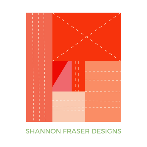
Double Windmill Quilt In Pantone Mocha Mousse
The possibilities of brown
Before you discount this colour as not being your thing (been there!), I’m hoping the following Double Windmill quilt mock-ups will help you see this neutral hue as the perfect pairing to warm up your colourway.
The Double Windmill Quilt is a dynamic design that encourages colour play due to the depth and movement the design offers. By switching up your dark and light hues, you can create an entirely different look and feel of your Double Windmill quilt.
To help you see that in play, I’ve created several mock-ups with different colourways to show you just how versatile the Double Windmill quilt can be, and how varied the finished quilts can be even when keeping Mocha Mousse as a constant colour companion.
Note – shown throughout, I’ve paired Mocha Mousse with Ruby and Bee Solids. I used the Pantone colour for Mocha Mousse, but this Mushroom colour would do the trick perfectly!


Mocha Mousse with a pop of orange
The very first mock-up I did featured these soothing taupey browns, with a pop of chartreuse and a corally orange.
You know my penchant for anything coral, so probably not a shocker that that’s what I was drawn to right out of the gate 😉


Blue, pink, and Mocha Mousse
Next up, I was curious about how Mocha Mousse would look paired with a pop of turquoise. This led to a gorgeous pull of deep blue gray, gray with some brightness from two different shades of pink. I love how colourful this one reads. The brown tones are more subtle compared to the first examples above, which just goes to show how using Mocha Mousse as a support rather than a feature in your colourway still adds lovely detail and warmth.


Yellows and browns
This combination is definitely not my usual go-to, but I was curious what effect bright yellows with a pop of deep brown might have on the feel of the quilt.
What I love is that it offers both a brightening and grounding effect. It’s got an interesting push-pull effect that I’m quite intrigued by. I especially like the glowing effect the 3rd mock-up of the Double Windmill quilt offers.


Red ombré
There’s something about ombré colourways that always hit the spot for me. Red, however, is not normally my go-to colour of choice. That said, for some reason, my instincts drew me to pull all the reds and see how they would look paired up with Mocha Mousse.
I surprised myself with how much I loved all 3 of these Double Windmill quilt mock-ups!
The one with the light windmill arms and the moodier quadrants was hitting all the right quilty spots for me 😊


Greens & Brown
Ever since my Plus Infinity Quilt, I’ve been loving green. That said, this pairing was my least favourite of all my colour play.
Why?
I’m not really sure.
Visually it has merit.
- There’s contrast.
- There’s depth.
- There’s warmth.
But it falls a little flat for me. What do you think?


Bleu Grey with a hint of Taupe
This bluey-grey combination was an unexpected hit for me.
- I love the depth the navy offers.
- I love the warmth the Mocha Mousse brings.
- I love the lighter details from the light grey and light grey/blue colours.
- I especially love the drama of the large mock-up below.


Double Windmill Digital Colouring Page
You’re Turn!
I’m seeing the Double Windmill quilt in a whole new light. Amazing the impact colour can have, right?!
If you’re looking for some quilty colour play of your own, then I encourage you to check out PreQuilt. It’s an online app that allows you to digitally recolour quilt patterns that you want to make. Use code Shannon to save 20% on your annual PreQuilt membership (basic or market).

Now that you’ve seen some different ways you could pair the Double Windmill Quilt with the Pantone Colour of the Year Mocha Mousse, I’m curious to know whether you see brown in a new light. Is there one mock-up in particular that caught your eye? Share in the comments below 😊
Find the Double Windmill Quilt Pattern in the shop to make your very own quilty masterpiece!
xo,
Shannon
Never miss a post – sign up for the weekly newsletter.
This post uses affiliate links. For more info, visit the FAQ page.
Leave a Reply